Branding: What's In A Name?
I started out in my publishing career a long, long time ago . . . before networking, before buzz words, before the Internet. Back in the ‘80s, you didn’t have to worry about your web presence. Your public exposure was pretty much limited to your local newspaper and the scattering of industry publications with black-and-white cut-and-paste ads. Social media was trying to coax wary shoppers over to your signing table in front of the mall bookstore and Xeroxing taped on clip art newsletters to send out in the mail. But even then, even though we didn’t have a name for it, even though resources were primitive at best, authors still looked for ways to stand out, to identify themselves to their audience.
In those Golden Years of romance, publishers pushed authors to take pen names. If you were prolific, as I was, you were saddled with several and faced with the problem of letting your readers know that Nancy Gideon, Dana Ransom, Lauren Giddings and Rosalyn West were all the same person to cash in on a cross-over fan base. Not easy when there wasn’t a main platform other than that duplicated newsletter and the occasional spiral bound book on pseudonyms. So, in effect, instead of building one author platform, you were building three or four simultaneously. Sometimes it took years for readers to realize that I was two of their favorite authors or to convince lovers of my historical novels to step over to the dark side with my vampire romances. It was a laborious, hit-or-miss process and, without any real communication other than at yearly conferences and your local writers group, there was no forum for sharing experiences. Every author was on their own to discover what worked . . . and what didn’t.
I stumbled on my taglines by accident. When signing titles under different names, I was looking for unique ways to personalize my signature. If a reader bought three pseudonyms, I didn’t want to slap “Happy Reading!” on each of them. So above my Dana Ransom historicals, it was “Hold your heart for Ransom!” Rosalyn West was paired with “Go West for Historical Adventure!” My Nancy Gideon vampire romances were prefaced with “Romance with a Bite” and “Romance you can sink your teeth into.” Fun ways to quickly tie the name to the genre and content that could follow from signature line to business cards to advertising. And that was the extent of my author branding . . . until the Internet explosion.
I needed a new, professional website, my first foray into author branding. I didn’t want one, but I needed one. So, how to present myself in a unified front as an author of multiple names and various genres? Three or four different websites? I shuddered at the thought of creating just one. Being basically frugal and a procrastinator, I didn’t want to spend time and money to do the abhorrent task more than once. So, what to do?
Necessity brought to mind a tagline I’d used when I had several different name/genre books coming out close together and wanted to get the most bang for my hard-earned buck. I’d put them under the heading of “Nancy Gideon . . . Romance by any other name.” I was sure Shakespeare wouldn’t mind. But what if I decided to write outside romance? I had done a horror movie novelization. What about non-fiction? Or straight suspense? The heading, though amply broad at first, had become too restrictive. So why not, expand it the way I planned to expand my career? Wasn’t that what branding was all about? Mirroring your writer persona and platform? So my identifying tagline became simply (or more complexly) “Nancy Gideon . . . by any other name.” That way, in my own frugal, procrastinating way, one line could do double duty, referencing multiple pen names AND multiple genres. Brilliant! But, too soon to feel smug. I had my identity. Now how to visually present it?
I’m all about accessorizing. Everything has to coordinate in my OCD world. How could I bring in elements from these vastly different areas: earthy historicals, gritty contemporary suspense, and dark paranormals? I had three main decisions to make on my brand presentation: author photo, logo and visual graphics, so I started by picking the key points that made up my brand. I am a writer of books. All my divergent projects contain romance and suspense. My voice is edgy and often dark. Okay, something to work with and build upon.
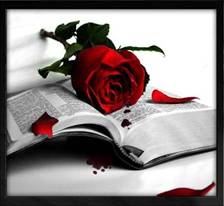
I had my tagline: “Nancy Gideon . . . by Any Other Name.” When looking for a logo graphic, I searched for a visual image that would represent who I was and what I was about. Writing. I wanted something featuring a book. The Shakespearean quote. Something with a rose that would signify romance. Edgy and dark. Strong colors and bold graphic lines. After a lengthy search of free clip art, I found just what I was looking for: an open book with a red rose dropping petals . . . or was that blood? Bonus! There was my suspense/paranormal link.
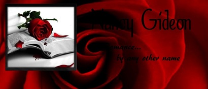
From the logo, I had my color scheme: black, red and white. I like it! Now to stylize with graphic flare. And for that, I went to a professional, graphic artist Patricia Lazarus. Pat had created my vampire romance covers for ImaJinn Books and I knew she could turn my ambitious ideas into a creative interpretation. We worked together to create my main website banner with the boxed in logo on a red backdrop. We ‘fabric’ shopped for almost an hour through one of her graphic art background sites to find the perfect texture and ripple pattern of silk. It looked good, but not great. I wanted something a little more unique, something that would carry over the rose theme . . . so why not a rose? Then we found a dynamically close-up graphic of unfurled rose petals, placed the logo on it . . . Perfect!
Then we played with the fonts, trying different sizes, scripts and shadow effects for my name and tagline until we found the right balance of crisp, clean and elegant. Thank goodness for Pat’s patience, because even though I have no artistic ability, I can see exactly what I want in my mind’s eye, and to get that ideal to conform to reality took some doing—sizing and resizing, playing with the hues of red (too orange, too pink, just right), one line or two of text, too ornate, too plain. Pat gave her Photoshop a work out with layers upon layers, moving, tweaking, and tossing. Who knew it would be such an exacting science? But when it was right, it was right on.
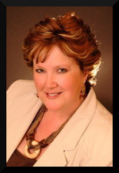
Adding my photo was the next step. I had two studio portrait shots, both with beige, gold, caramel and rich brown tones from my hair color (which really does resemble my non-fiction cover doppelganger) to my jewelry. Hmmm . . . How was that going to play out next to the red, black and white of my banner? With handy ‘paintbox’ in cyber hand, Pat mixed up a rich new color for our rose and the background silk, bringing a warmer russet red in to compliment the red of the logo rose AND the browns in my photo. That russet tone accented with black, red, white and gold is the unifying foundation for all my promotional endeavors.
To update my ‘look’, I brought in my book covers. I know, I know, I’m supposed to use my photo or logo to reinforce my brand on all my Social Media efforts, but I like using my recent book cover as my FB profile picture and as the background for my Twitter account. Thankfully the first cover of my By Moonlight dark paranormal series, MASKED BY MOONLIGHT was in a glorious red-orange so it popped against my visual brand.
To update my ‘look’, I brought in my book covers. I know, I know, I’m supposed to use my photo or logo to reinforce my brand on all my Social Media efforts, but I like using my recent book cover as my FB profile picture and as the background for my Twitter account. Thankfully the first cover of my By Moonlight dark paranormal series, MASKED BY MOONLIGHT was in a glorious red-orange so it popped against my visual brand.
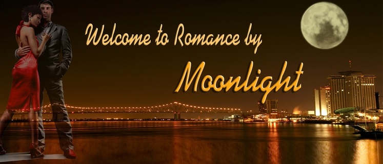
Since I knew I had six books coming out in that series, the first four of them revolving around the relationship of the same hero and heroine, I had Pat make a unique banner for them. She ‘shopped’ a graphic of couple until it became Max and Charlotte, using the red of her dress and his shoes as a strong pull-together color against an otherwise brown and gold backdrop of the waterfront of New Orleans under a huge moon. That couple graphic became the focus of my By Moonlight promotions under my Nancy Gideon brand by placing it on my business card, with the graphic background lengthening to become the backdrop on my web and blog page
To quote the A-Team, “Don’t you love it when a plan comes together?” Everything I wanted to reflect my brand.
Nancy Gideon . . . By Any Other name!
Nancy Gideon . . . By Any Other name!
For those of you who have purchased the first chapter of GETTING IT OUT THERE: PR AND SOCIAL MEDIA FOR WRITERS, click the Forum button below to join in on the Discussion Board!
Branding through taglines and slogans . . . Does it work?
You tell me. See if you can identify the individual or the product listed below from these brief descriptors. Make your list and then match it to rate the success these taglines/slogans.
Movies/TV:
1) Smash Hit Romantic Comedy. With Zombies
2) Where Were You in ’62?
3) Who You Gonna Call?
4) There Can Be Only One
5) A whole New Chapter in Crime Solving
6) Never Sleep Again
7) The Dream is Real
8) Trapped in Time, Surrounded by Evil, Low on Gas
9) Just When You Thought it was Safe to Go Back Into the Water
10) The Coast is Toast
11) Drink From Me and Live Forever
12) An Adventure 65 Million Years in the Making
Newsworthy People: Entertainers/Athletes/Characters/Authors:
1) King of Pop
2) Queen of Soul
3) Italian Stallion
4) Queen of Mean
5) Sultan of Swat
6) Ace of Cakes
7) Master of Disaster
8) Queen of Romance
9) The Austrian Oak
10) King of Swing
11) Muscles from Brussels
12) The Greatest
13) Basketball Jesus
14) The Brown Bomber
Product Slogans:
1) How do you spell relief?
2) Strong Enough for a Man, but made for a Woman
3) The Ultimate Driving Machine
4) Reach Out and Touch Someone
5) The Quicker Picker Upper
6) Breakfast of Champions
7) Tastes Great, Less Filling
8) Once You Pop, you can’t stop.
9) Like a Rock
10) Does she or doesn’t she?
11) Celebrate the Moments of your life
12) Manly, Yes, but I like it, too.
How do they rate?
34 To 38: They’ve done their job and YOU are their target consumer
28 to 33: They’ve found their niche and you know what you like
20 to 27: They need to broaden their appeal and you are very discriminating
Below 20: They haven’t done their job and you need to get out more
See which category applies to the impact of commercial branding on you by checking your answers against these:
Movies/TV:
1) Shawn of the Dead, horror comedy movie
2) American Grafiti, movie classic
3) Ghostbusters, all both movies
4) Highlander, too many sequels and a long running TV series
5) Castle, TV series
6) Nightmare on Elm Street, slasher movie series
7) Inception, mind- and space-bender movie
8) Army of Darkness, horror cult classic movie
9) Jaws II, you should have been afraid to go back into the theater’
10) Volcano, disaster movie
11) Interview with a Vampire, movie from Anne Rice’s novel
12) Jurassic Park, movie blockbuster
Newsworthy People:
1) Michael Jackson, singer/entertainer
2) Aretha Franklin, R&B singer
3) Rocky Balboa, movie boxer played by Sylvester Stalone
4) Leona Helmsley, hotel chain owner
5) Babe Ruth, baseball legend
6) Duff Goldman, Food Network star
7) Irwin Allen, producer/director
8) Barbara Cartland (or some would now claim Nora Roberts)
9) Arnold “ the former Govenator” Schwarzenegger when body builder
10) Benny Goldman, band leader
11) Jean Claude Van Damme, martial arts movie actor
12) Muhammad Ali, boxer
13) Larry Bird, basketball
14) Joe Louis, boxer
Product Slogans:
1) Rolaids antacids
2) Secret deodorant
3) BMW
4) AT&T
5) Bounty paper towels
6) Wheaties
7) Miller Lite beer
8) Pringles potato chips
9) Chevy Trucks
10) Clairol hair color
11) General Foods International Coffee
12) Irish Spring Soap
Movies/TV:
1) Smash Hit Romantic Comedy. With Zombies
2) Where Were You in ’62?
3) Who You Gonna Call?
4) There Can Be Only One
5) A whole New Chapter in Crime Solving
6) Never Sleep Again
7) The Dream is Real
8) Trapped in Time, Surrounded by Evil, Low on Gas
9) Just When You Thought it was Safe to Go Back Into the Water
10) The Coast is Toast
11) Drink From Me and Live Forever
12) An Adventure 65 Million Years in the Making
Newsworthy People: Entertainers/Athletes/Characters/Authors:
1) King of Pop
2) Queen of Soul
3) Italian Stallion
4) Queen of Mean
5) Sultan of Swat
6) Ace of Cakes
7) Master of Disaster
8) Queen of Romance
9) The Austrian Oak
10) King of Swing
11) Muscles from Brussels
12) The Greatest
13) Basketball Jesus
14) The Brown Bomber
Product Slogans:
1) How do you spell relief?
2) Strong Enough for a Man, but made for a Woman
3) The Ultimate Driving Machine
4) Reach Out and Touch Someone
5) The Quicker Picker Upper
6) Breakfast of Champions
7) Tastes Great, Less Filling
8) Once You Pop, you can’t stop.
9) Like a Rock
10) Does she or doesn’t she?
11) Celebrate the Moments of your life
12) Manly, Yes, but I like it, too.
How do they rate?
34 To 38: They’ve done their job and YOU are their target consumer
28 to 33: They’ve found their niche and you know what you like
20 to 27: They need to broaden their appeal and you are very discriminating
Below 20: They haven’t done their job and you need to get out more
See which category applies to the impact of commercial branding on you by checking your answers against these:
Movies/TV:
1) Shawn of the Dead, horror comedy movie
2) American Grafiti, movie classic
3) Ghostbusters, all both movies
4) Highlander, too many sequels and a long running TV series
5) Castle, TV series
6) Nightmare on Elm Street, slasher movie series
7) Inception, mind- and space-bender movie
8) Army of Darkness, horror cult classic movie
9) Jaws II, you should have been afraid to go back into the theater’
10) Volcano, disaster movie
11) Interview with a Vampire, movie from Anne Rice’s novel
12) Jurassic Park, movie blockbuster
Newsworthy People:
1) Michael Jackson, singer/entertainer
2) Aretha Franklin, R&B singer
3) Rocky Balboa, movie boxer played by Sylvester Stalone
4) Leona Helmsley, hotel chain owner
5) Babe Ruth, baseball legend
6) Duff Goldman, Food Network star
7) Irwin Allen, producer/director
8) Barbara Cartland (or some would now claim Nora Roberts)
9) Arnold “ the former Govenator” Schwarzenegger when body builder
10) Benny Goldman, band leader
11) Jean Claude Van Damme, martial arts movie actor
12) Muhammad Ali, boxer
13) Larry Bird, basketball
14) Joe Louis, boxer
Product Slogans:
1) Rolaids antacids
2) Secret deodorant
3) BMW
4) AT&T
5) Bounty paper towels
6) Wheaties
7) Miller Lite beer
8) Pringles potato chips
9) Chevy Trucks
10) Clairol hair color
11) General Foods International Coffee
12) Irish Spring Soap
